


Sometimes when you see a pattern, you can imagine the fabrics you want immediately. When I designed my Modern Patchwork quilt, I could envision how many teal fabrics vs. black and white fabrics the quilt should have about half of each. I then added the black and white border to make tone down the amount of color. I also could easily see that all the prints needed be small as the pieces were small, yet there should be a variety of designs to help break up the small patterns. I made sure to include floral fabric, stripes, small dots, and more. To break up the busy fabrics, I also put in spots of solid black.
 |
| The Modern Patchwork |
 |
| Blossom Quilt |


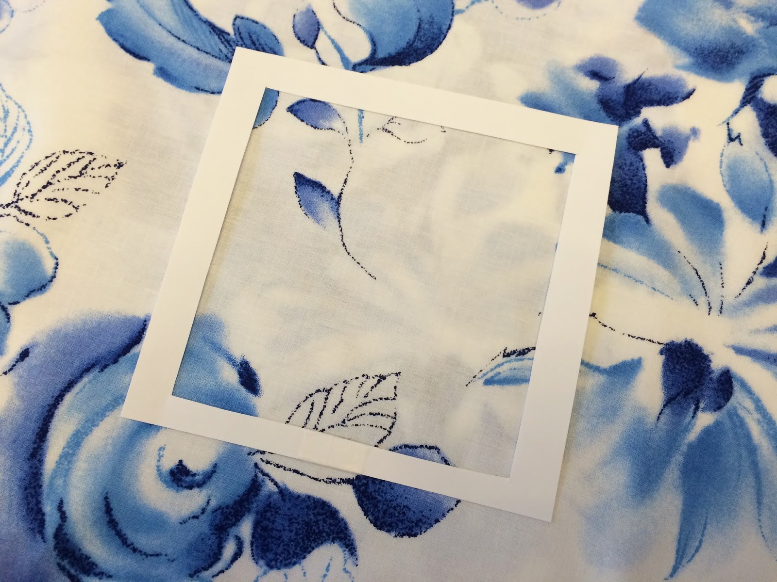
This first fabric I put my quilt square frame on has a very versatile print. The flowers are small so they show up well in a small square, yet the amount of white space in the fabric would also make it good for larger squares.
 |
| First fabric. |
 |
| Second fabric. |
 |
| Third fabric. |
 |
| Third fabric. |
 |
| Fourth fabric. |
 |
| Fourth fabric. |

Fabric color depends more on your style. It is best to include a light, dark, and medium fabric. How many different colors you include is up to you. Quilts don't always need a ton of colors. These next two quilts are examples of using very few colors.


Adding as many colors as possible to your quilt is fun and can definitely turn out beautiful! The actual color doesn't matter so much as the value. Take this table runner for example. The little squares contain green, purple, yellow, and blue. Each color is slightly on the dark side so they contrast nicely without clashing.


This next table runner varies less in color, and more in pattern.

Notice how the green fabric, while different from the red in both color and print, uses the same red colors for it's flowers. Also, look at how the red fabric has small hints of green in the leaves. Next, the gold fabric is the same color as the faint gold highlights in the other fabrics. This is how almost all designers design fabric collections to be.
In summary:
- Choose each fabric pattern according to the size of the pieces in your quilt, and consider what patterns each fabric will be next to. Placing a small patterned floral fabric next to multiple other small floral fabrics can make a quilt look busy and all the fabrics can run together.
- Add as much or as little color as you want to your quilt. Keep in mind not only the primary colors of the other fabrics, but also the colors of the details in the print. This can help you coordinate fabrics and also get good contrasting colors.
- Color value is the main thing to pay attention to. Bright pink will contrast nicely with a bright green, but a salmon/orange pink wouldn't coordinate well with a dark forest green.
The patterns for some of the quilts shown are available in my shop here.
Thanks for your ideas regarding selection of fabrics. This is the point in creating a quilt where I am stuck. Today I have spent several hours enjoying your blog and have learned a lot. The scrap quilt blocks are quite an inviting place to begin to use this information with my gobs of scraps.
ReplyDeleteI am so glad you are enjoying reading my posts! I have been having fun coming up with my scrap block designs and sharing them with other quilters. Thank you for coming to my blog!
Delete